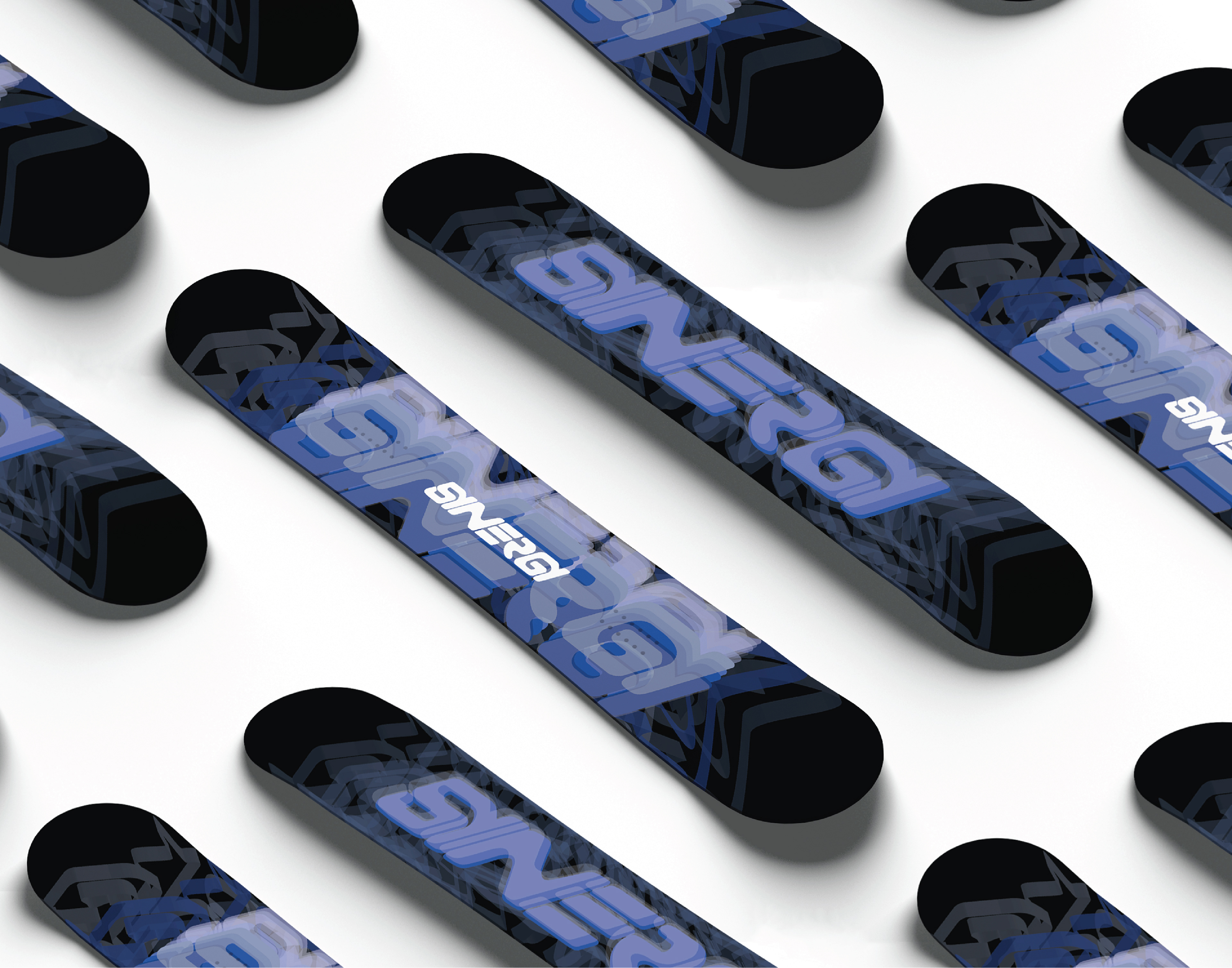
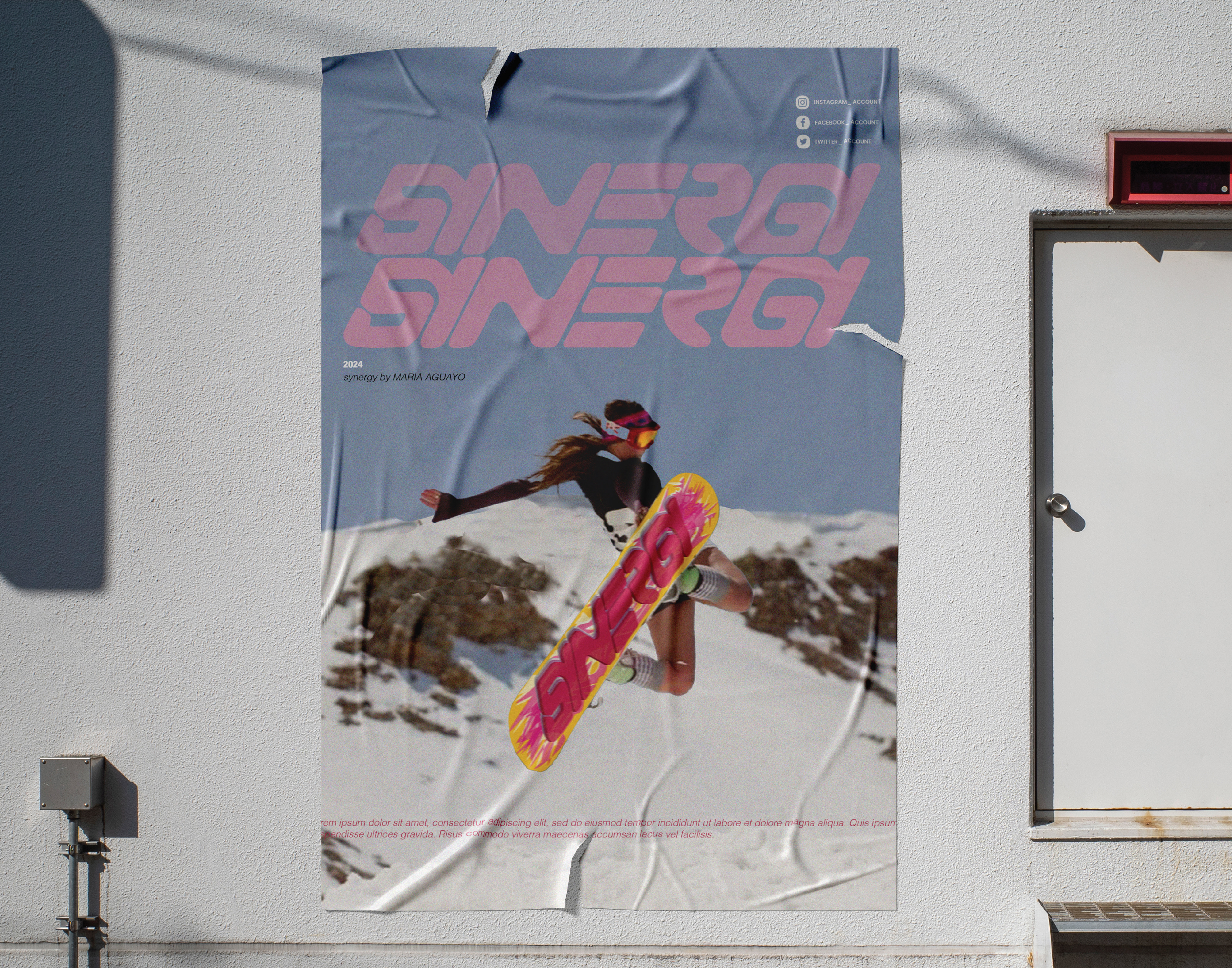
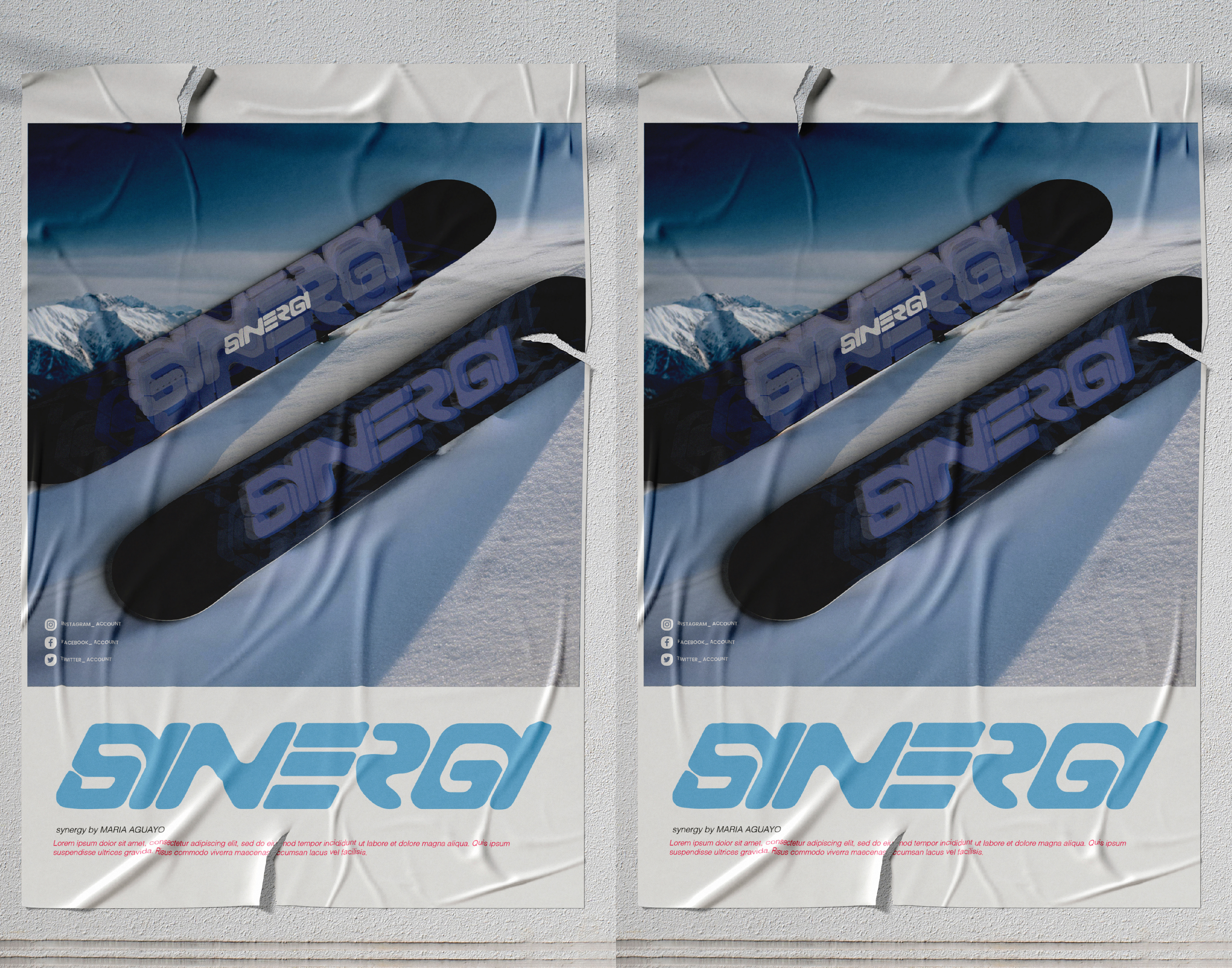
Synergy is a snowboard brand tailored for professional extreme snowboarders. It embodies boldness, energy, and dynamic movement. The brand vision is to reflect the skill, precision, and explosive power needed for high-level snowboarding through design and branding elements.

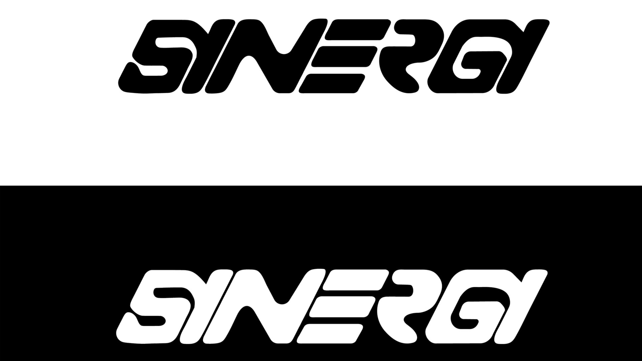
The Synergy logo is a custom typeface created by hand, with numerous sketches and refinements to capture the brand's essence. The typography leans forward to symbolize movement, and certain letters are interconnected, highlighting the fluidity of sliding on snow.

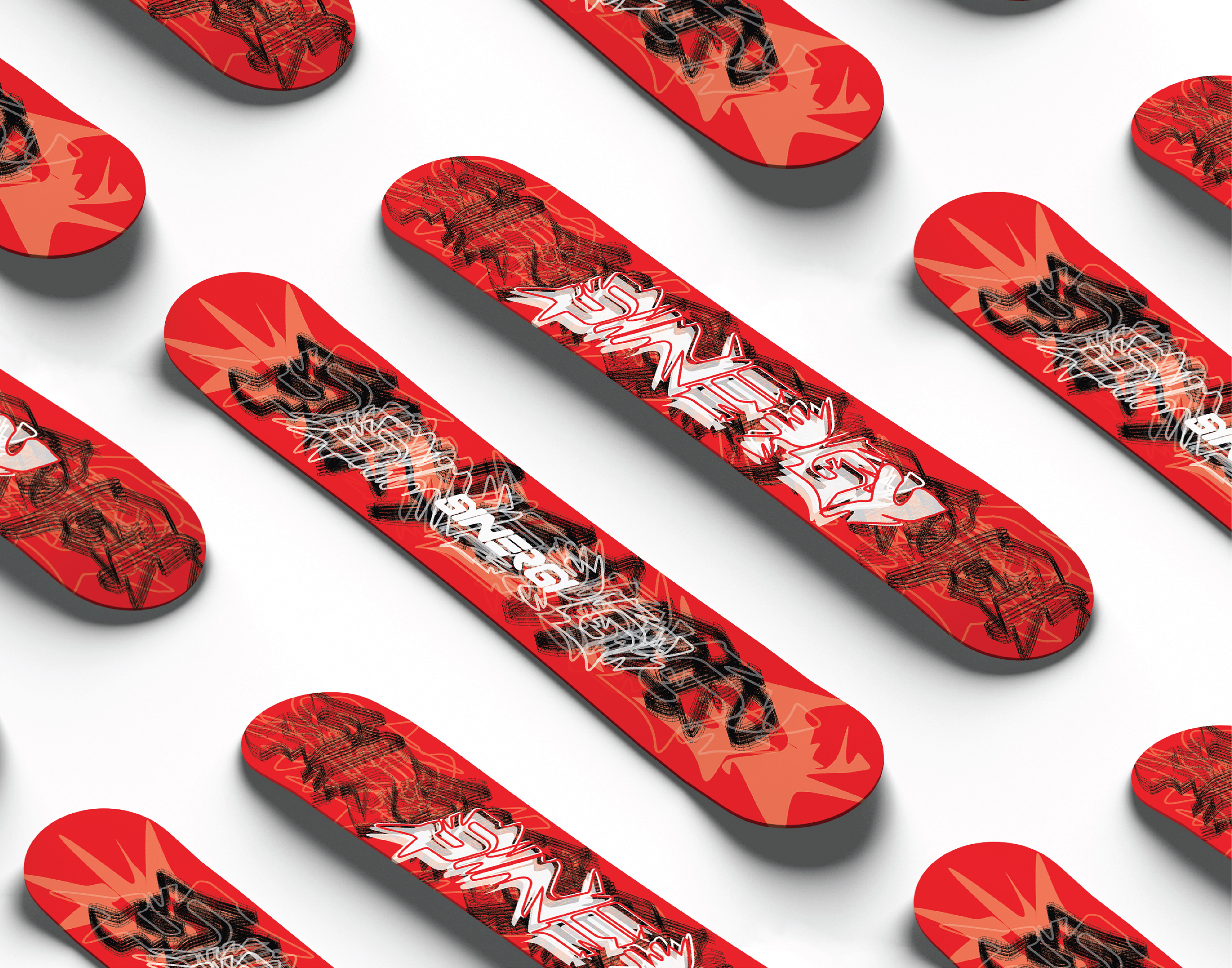
The design language of Synergy revolves around bold, explosive abstract art, and bright colors. The artwork on the boards is meant to capture the fast-paced, adrenaline-filled experience of snowboarding, emphasizing sharp turns, fluidity, and raw athleticism.
Repetition of shapes, bold patterns, and abstract forms symbolize the repetitive, skillful maneuvers snowboarders master
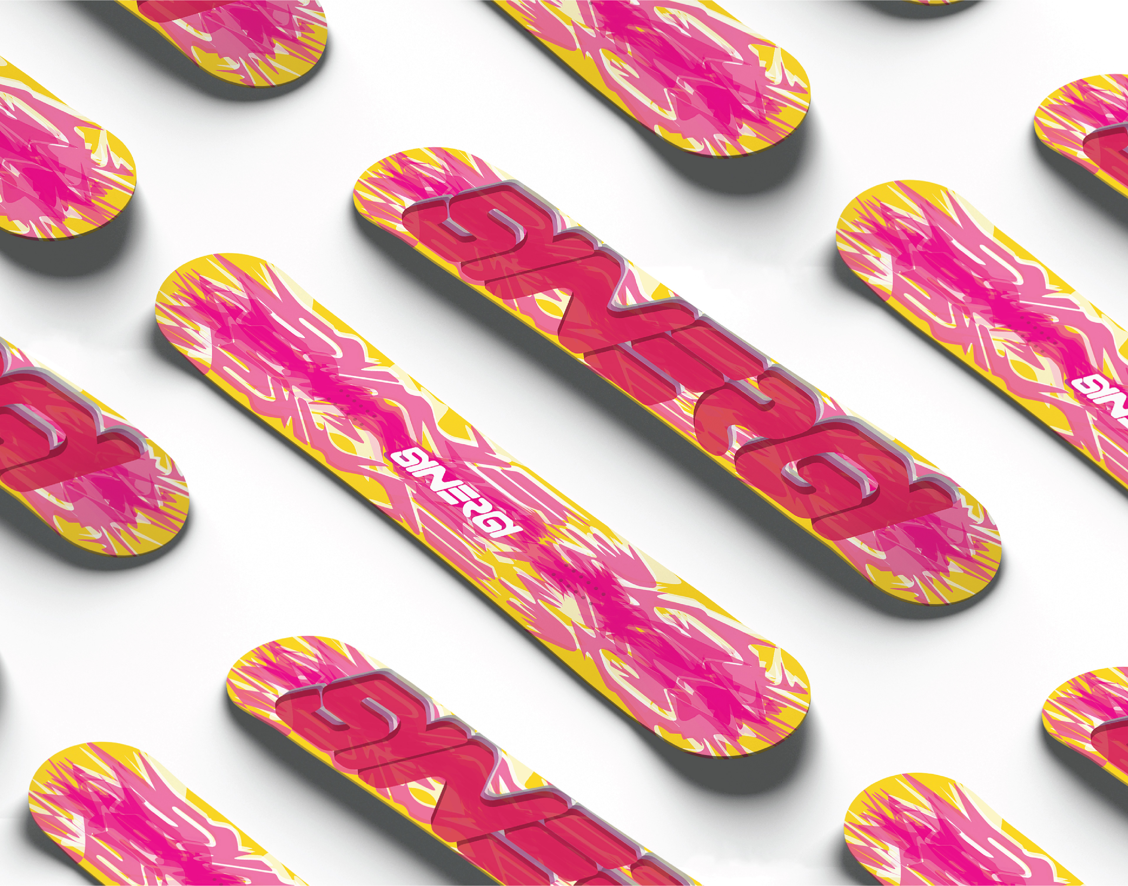
The explosive energy of the abstract art creates a sense of the unpredictable, intense moments that extreme snowboarders thrive on.
By capturing the essence of snowboarding through its designs, Synergy offers riders not just a board, but a visual representation of their skill and passion.